

Content editors are users too. This is all too often forgotten by UX design teams in the typical web design project. We carefully outline detailed personas for the primary audiences who will interact with the front-end website, but the back-end editors are often given lower priority. Why do we place such little emphasis on the user experience of our content editors?
“My CMS Sucks”
I spoke recently to a client who had to endure a 6-step process for adding a stylized pull quote to an article within her organization’s web content management system (CMS).
As is so often the case, the previous web editor had departed the company, and it was now up to her to make updates, with little documentation. She walked me through the process, which included opening Photoshop, sizing a graphic, exporting the graphic, placing the graphic in the CMS, aligning the graphic in HTML and saving, hoping it all worked correctly.
This would be a daunting task for anyone, let alone someone who isn’t familiar with editing websites. I wish this was a rare occurrence, but in my experience with client services, it’s all too common. In fact, a bad editing experience is one of the most common complaints I hear from clients who are looking for a website redesign.
Choosing The “Right” CMS
I wish I could tell you that one CMS is the end-all solution, but, unfortunately, that's not a reality. As Caleb Mellas notes in the article What does an optimal CMS user-experience look like?, "the optimal CMS is not really possible because everyone’s needs are different."
My team and I have built client websites in a wide variety of systems. In that time, we’ve learned there are some best practices that developers, designers and content strategists can follow in any content management system in order to make it more user-friendly. While I’ll include many examples, including those from my preferred system, Craft CMS, I’ll try to be as platform-agnostic as possible.
I’ll also try not to be too technical because I want UX teams to be involved in the CMS decision and implementation as much as the technical teams. It’s not so much knowing how to implement these recommendations, but knowing that they are indeed possible and bringing those recommendations to the team.
Let’s build the tools and the infrastructure that we need to support [editors] in creating great content. – Karen McGrane, Content Strategist
The Editing Experience Matters
Why should we care about the client's editing experience? After the website has been created, the content management system we’ve left with editors is really where our designs start to come to life. A good CMS editing experience means:
- Less Support Cost and Time: Abetter editing experience simply means less support time for the developer, agency or people who support the website. That’s something that will get any executive or client on board.
- Better Content: Happier editors should mean better, higher quality and fresher content. If I have a pleasant experience as the editor, I’ll be more likely to log in and make updates, which, in turn, benefits the site’s end-users.
- Empowered Editors: We can provide better tools that empower, rather than restrict, the editor. One of the top criticisms of content management systems is that they’re “locked down.” As you’ll see, this doesn’t have to be the case in today’s modern CMS and can actually give the editor more control than ever.
- Higher Quality Design: An intuitive, guided editing experience means less room for unexpected edits that “break” our carefully crafted visual design and information architecture.
When it comes to content creator workflow, time equals money – Quinton Mosley, “What's It Take to Create a User-Friendly CMS?”
Creating a Better Editing Experience
So how can we go from an experience that is perceived as a chore to one editors love? I’ll outline 4 ways:
- Collaborative Planning: Take the time to understand the editorial workflow, breaking down the process and content itself through content modeling.
- Flexible Editing: Create a balanced, flexible and intuitive editing experience that empowers, rather than restricts, the editor.
- Automation: Let the technology handle common tasks when possible, preventing actions that may break the design.
- Contextual Training: Involve clients and stakeholders in the editing process prior to launch, providing contextual documentation directly within the interface.
Structured content means the content is stored based on what it means rather than how it looks. – –Caleb Mellas, “What does an optimal CMS user-experience look like?”
Collaborative Planning
Get involved early on. That means that the UX and Content teams should be in conversations surrounding both the implementation and the purchase of the CMS. Marli Mesibov notes in the article "What a CMS Won’t Do For You" that "quite often, CMS purchasing and configuration decisions are being made by an IT person with a checklist, rather than someone with deep knowledge of the content being managed."
The UX team should know the organization’s content publishing process better than anyone and can start to identify areas of improvement even in the initial stages.
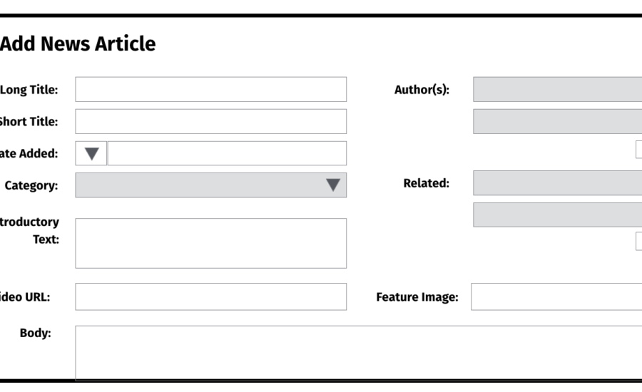
You’ve also got to be involved in “breaking down” or structuring content. That includes planning out the fields and workflows of the CMS, known as the content modeling process. This is where content, templates and designs are mapped to the fields in the CMS. This process should begin as soon as we begin to define our content and design elements.
Building all content all together in one body field goes against core content management principles.
While many users think of your website as “pages” of information, they’re really small pieces that come together to form the page.
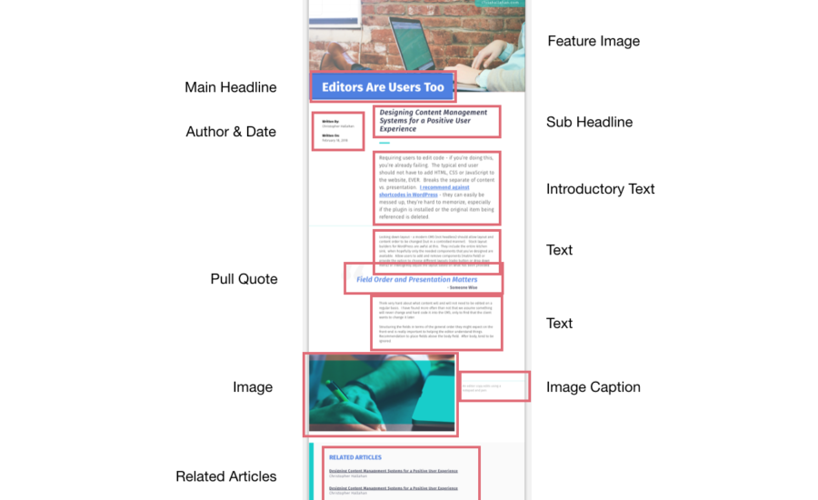
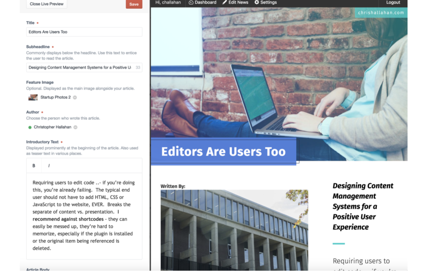
Adequately planning out fields and content types (such as news articles, staff profiles and products) will allow you to make the editing process fast and flexible. In the example below, I’ve outlined a simple content model and content template for a news article on a sample website.
Flexible Editing
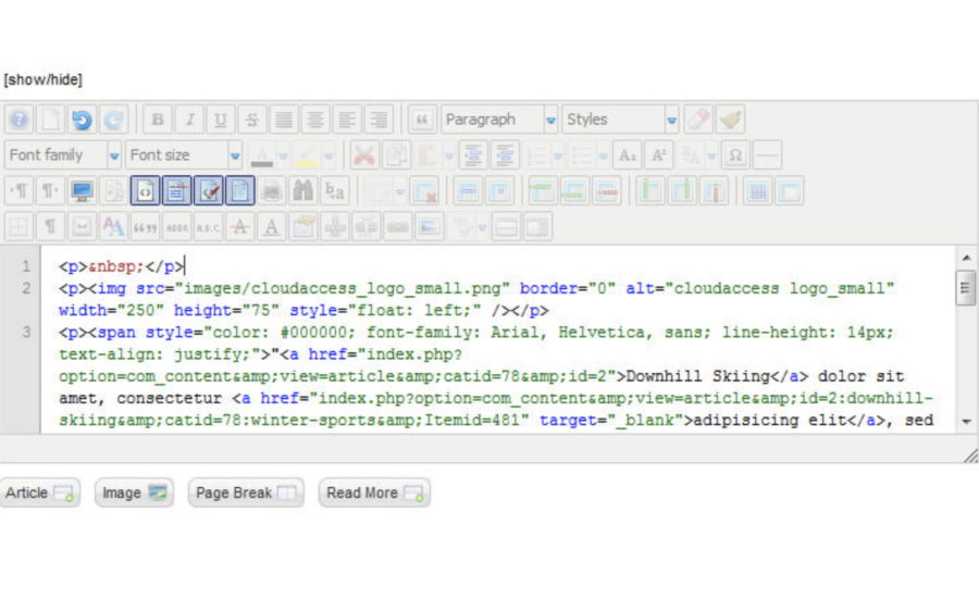
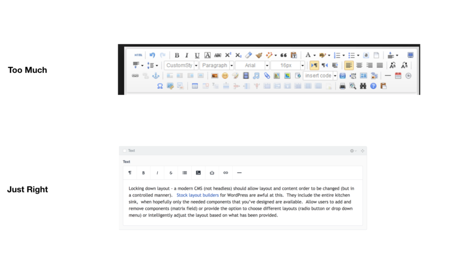
A flexible editing experience doesn’t mean simply giving users access to add or modify their own HTML and CSS. Far from it, in fact.
Requiring editors to touch even the smallest amount of code is a hinderance to the editing experience and should be avoided. For one, it breaks the separation of content and presentation. Even small chunks of code like WordPress shortcodes and YouTube embed codes are error-prone. These components should already be baked into the template and accessed through the user interface.
I also recommend hiding the “Source” or “Code” views where editors can (intentionally or by mistake) toss in their own styles or code. At the very least, automatically filter out elements and code that isn’t approved for use.
Trying to make the CMS behave ‘like Word’ is solving the wrong problem. Because Word is not a good way to edit content. – Caleb Mellas, "What does an optimal CMS user-experience look like?"
Flexible editing does mean that fields should be labeled, as well as ordered, intuitively and consistently. You should structure your fields based on what order the user might expect to find them in the end-product. Of course, there are exceptions. If an item is required or really important, I recommend placing it before the main content field. As you would with web navigation, be extremely straight forward with field labels.
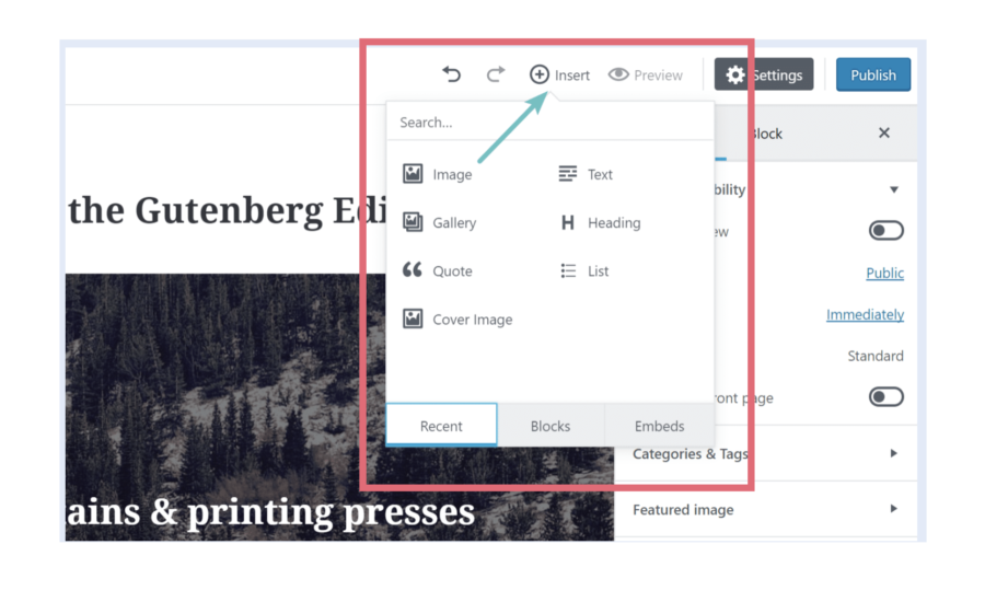
Additionally, flexible editing means that editors have options. Locking down the layout, while providing more control, is no longer the default in a modern CMS. Allow editors to add and remove blocks of content, choosing from predefined components to truly customize content across the website. Providing options in a controlled manner is something systems like Craft CMS, WordPress’s Gutenberg, and even Squarespace, excel at.
Finally, with all of this customization, users need an effective way to preview the changes they’re making. Ensure your CMS provides an adequate preview mode that displays the content using the stylesheets and format across multiple devices or platforms. The preview functionality in many systems does not provide a realistic representation of the final design and is difficult to visualize.
Automation
Today’s systems have many automatic capabilities that can speed up the editing experience, while preventing common errors. Take advantage of them.
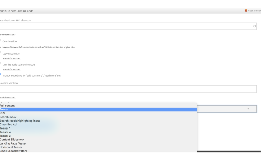
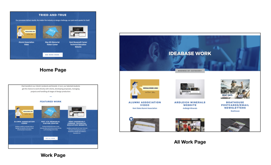
That’s no better demonstrated than in the reuse of existing content within the CMS. If you’re having users recreate content that already exists elsewhere in the CMS, you’re making them work too hard. Take advantage of content reuse features that allow us to create systems of content that automatically appear in multiple places and formats. Added a new product? It should automatically appear on your site’s home page and be properly categorized in the products section of the website.
When linking to or reusing existing content in your CMS, also make sure you’re using symbolic links. That ensures if content is ever updated and the URL changed, the links will automatically update.
You can also protect editors from themselves by limiting options to only the ones they actually need. Avoid installing plugins or toolbars that clutter the interface with unneeded options. If functionality must be installed, hide it from editors using roles.
You can also use common forcing functions like character limits, item restrictions, required fields and min-max items to ensure users are adding the appropriate amount of content.
Finally, allow the system to intelligently handle images. As an editor, I shouldn’t have to prepare images in an external application before uploading them to the website. Allow the CMS to automatically crop images based on preset specifications and optimize them for the web upon upload. With new HTML features like responsive images, it’s easier than ever to swap out images based on device size and context - all without the editor's awareness.
Contextual Training
Now that you’ve created a flexible, automated and well-planned system, you’ll have to train the clients or editing who will ultimately be using it.
I recommend getting clients and stakeholders to participate in the CMS workflow early. That means having them add and edit content even before the website goes live. We wouldn’t wait to test the user-facing design with end-users a day before release, so why do the opposite for CMS users?
Getting clients involved early can help you identify usability and technical issues sooner in the process, before it’s too late to make changes.
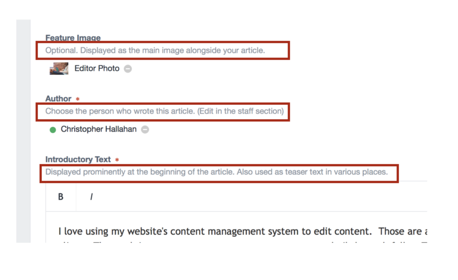
Training in context also means providing training directly within the CMS user interface. While providing a training manual at the end of the project is helpful, these guides are easily lost and forgotten as the organization changes. Place the help documentation directly within the user interface, both as clear and helpful text on each screen and field of the interface, or even as a tab itself in the dashboard of the CMS.
The best documentation can easily be accessed where your users are working day-to-day.
Training content editors is far easier if the elements that they have to work with are consistent across all pages of the site. – Content Management Systems, Usability First
What’s Next?
Whether you’re part of the design, UX or technical implementation of a CMS, I hope you’ve found these steps helpful. If you’re looking for even more resources on creating user-friendly content management systems, check out some of the additional helpful articles below.
You can also follow me on the web and Twitter for upcoming articles on user experience design, and I'm available for independent consulting on website content management system implementation.
Helpful Articles & Resources
- Karen McGrane - Content Strategy
- What does an optimal CMS user-experience look like?
- What a CMS Won’t Do for You
- Creating A Usable Content Management System (CMS)
- How to Build a CMS User Interface You’ll Love to Use
- Designing For Content Management Systems
- Content Management Systems (Usability First)
- WordPress Reimagined in a More User-Friendly Way
- pexels.com (Stock Photography)